Note
New advice on adaptive GTK+ applications development are regularly documented on this page.
GTK+
GTK+ is the graphical application framework used to develop all GNOME applications. This section presents tips and tricks with GTK+ to help you develop great adaptive applications for GNOME, for general GTK+ and GNOME development resources please check the GTK+/GNOME Resources page. Don’t forget to check its documentation out.
libhandy is a widget library for GTK+. It contains widgets useful for both phone applications and adaptive applications and it is going to be used in that page as an extension to GTK+. Don’t forget to check its documentation out.
Warning
From now on, this section assumes you are familiar with the basics of GTK+ application development. It also assumes you are using GTK+ 3.24.1 or newer and libhandy 0.0.4 or newer as these versions received improvements required for adaptive apps to function properly.
The GTK+ Inspector
The GTK+ Inspector is a tool giving you direct and dynamic access to the internal state of the user interface of your GTK+ application at runtime. It is similar in concept to a web inspector.
The GTK+ Inspector is extremely convenient to debug your GTK+ application. To use it you first need to enable it via GSettings:
$ gsettings set org.gtk.Settings.Debug enable-inspector-keybinding true
To trigger the inspector simply press Control-Shift-I or Control-Shift-D when running the application.
Alternatively you can set the GTK_DEBUG environment variable to interactive:
$ GTK_DEBUG=interactive your-application
Note
For the GTK+ Inspector to work in your flatpaked application, see how to enable dconf access in the the Flatpak documentation.
Adaptive Labels
A GtkLabel can prevent your application’s UI from reaching really small sizes, but there are simple tricks to make them do so. Consider using one of the following tricks on each of your labels!
Allowing your label to ellipsize will cut a part of your string when there isn’t enough space for it, you can enable it and choose which part will be cut with the GtkLabel ellipize property. Use it if you really need your label to be on a single line.
Note
If you allow your label to be elipsized, make sure that its xalign property matches its justification or your label may not be properly aligned when ellipsized: 0 for left, 1 for right, or 0.5 for center.
Letting your label wrap will preserve the integrity of the text at the expense of more height, you can enable it with the GtkLabel wrap property and choose how to wrap with the GtkLabel wrap-mode property.
Note
By allowing the label to wrap, it will always request enough height when fully wrapped. Consider putting your label or a widget containing it into a scrollable window to avoid height becoming a problem.
To help you implement these, we created an example application, just clone it in GNOME Builder and check the adaptive-labels branch out.
Title Bars
A GtkHeaderBar is meant to be used in a window’s title bar, typically presenting to the user the application’s title, various controls and a close button.
HdyTitleBar is a simple container that takes care of the look of the title bar. It is a very convenient widget as it allows header bars to look good when animated by ensuring they don’t draw the title bar’s background themselves, which is a requirement for adaptive apps, and it simplifies common operations like setting the selection mode a lot.
Some title bars are composed of multiple header bars, in such a case it is advised to separate them with a GtkSeparator with the sidebar style class. To help spreading the window decoration across all header bars as if they were only one, just show the close button on all of your header bars and put them into a HdyHeaderGroup in the same order they appear in the title bar.
Here is an simple GtkBuilder example showing this section’s advice:
<?xml version="1.0" encoding="UTF-8"?>
<interface>
  <object class="GtkWindow">
    <child type="titlebar">
      <object class="HdyTitleBar">
        <child>
          <object class="GtkBox">
            <child>
              <object class="GtkHeaderBar" id="start_header">
                <property name="show-close-button">True</property>
              </object>
            </child>
            <child>
              <object class="GtkSeparator">
                <style>
                  <class name="sidebar"/>
                </style>
              </object>
            </child>
            <child>
              <object class="GtkHeaderBar" id="end_header">
                <property name="show-close-button">True</property>
              </object>
            </child>
          </object>
        </child>
      </object>
    </child>
  </object>
  <object class="HdyHeaderGroup">
    <headerbars>
      <headerbar name="start_header"/>
      <headerbar name="end_header"/>
    </headerbars>
  </object>
</interface>
Selection Mode
As per the GNOME human interface guidelines, applications may enter a special selection mode. Setting the selection mode to an application in previous versions of GTK+ was complicated as it implied having to manually add or remove the selection-mode style class to each of your header bars, while their separators were condamned to look ugly as they were not styled accordingly.
HdyTitleBar and recent improvements in the default theme of GTK+ simplifies that a lot, simply toggle the selection-mode boolean property of HdyTitleBar for their descendants to be styled accordingly, including separators with the sidebar style class.
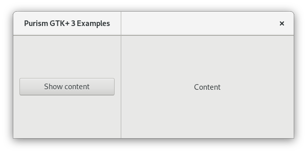
Adaptive Grid Layout
Some applications have a grid layout where several panels sit side-by-side and extend to the title bar. To make an application with a adaptive grid layout, follow these steps:
- The basic layout:
- In the title bar put a HdyTitleBar, put a HdyLeaflet in it in which you will put your sidebar’s GtkHeaderBar, a GtkSeparator and your content’s GtkHeaderBar.
- In the window put a HdyLeaflet in which you will put your sidebar widget, a GtkSeparator and your content widget.
- Add the sidebar style class to the separators from the titelbar and the window.
- Make the close buttons of your header bars visible.
- Make it a grid:
- Put your sidebar widget and its header bar into the same horizontal GtkSizeGroup to ensure they request the same minimum width.
- Put your separators into the same horizontal GtkSizeGroup to ensure they request the same minimum width.
- Put your content widget and its header bar into the same horizontal GtkSizeGroup to ensure they request the same minimum width.
- Horizontally expand the content widget and the content header bar.
- Solidify the layout:
- Give the sidebar child name to your sidebar widget and its header bar.
- Give the content child name to your content widget and its header bar.
- Make your header bar leaflet’s child and mode transitions to slide to improve spacial navigation semantics.
- Bind your window’s leaflet’s visible child name and your child and mode transitions (duration and type) to your header bar leaflet’s in a bidirectional way to ensure they always appear as a single unified panel.
- When the leaflets are folded, make the header group focus on the currently visible header bar, make it focus on nothing otherwise.
- Navigate in the layout:
- Add a back button at the start of your content header bar.
- When your header bar leaflet is folded, make the back button visible, make it invisible otherwise.
- When the back button is clicked, make the sidebar the visible child of the leaflets.
- When an entry of your sidebar is clicked, make the content visible.
To help you implement these, we created an example application, just clone it in GNOME Builder and check the adaptive-grid-layout-0-0-3 branch out.